A Chinese character tattoo goes wrong in five distinct ways, and only one of them is the mistake people worry about. Getting the wrong character is rare. Getting the right character in the wrong writing system, from the wrong font, at a size it cannot survive — that is ordinary, and none of it shows up in a Google search before the needle does.
This page is about what actually goes wrong, in the order the errors happen. It is written from Taiwan, where traditional characters are the ordinary writing system, and it uses the Ministry of Education’s standard forms as the reference throughout.
The error nobody makes as often as you would think
The famous failure — the tattoo that says something ridiculous — is well documented but not the common case. Tian Tang catalogued it for eighteen years at Hanzi Smatter, a blog subtitled “dedicated to the misuse of Chinese characters in Western culture”; NPR covered his work in 2006, describing a tattoo whose last two characters had been inked in reverse order. Victor Mair at the University of Pennsylvania’s Language Log sorted the failures into categories: word-for-word translations that are not idiomatic Chinese, raw machine-translation output, and characters inked over earlier characters.
Nobody has ever measured how often this happens. There is no survey, no rate, no count — only a long anecdotal record. So this article makes no claim about frequency. What it can do is describe the failure modes precisely, because each one is avoidable by a specific check.
Error one: the character is right, the writing system is wrong
This is the error we would rank first if we had to rank them, because it is invisible to the person making it.
There are two standard sets of Chinese characters in use, defined by two different governments in two different decades. Taiwan’s is set by the Ministry of Education, whose Standard Form of National Characters was announced on 1 September 1982 and fixes 4,808 characters; the live reference is the Dictionary of Chinese Character Variants, now in its seventh edition. The People’s Republic set its own list much later: the Table of General Standard Chinese Characters, issued by the State Council on 5 June 2013, covering 8,105 characters, with an appendix mapping 2,574 traditional forms onto their simplified replacements.
Where the two lists disagree, a tattoo has to pick a side. Here are nine characters people ask for often, with the Taiwan dictionary entry number for the traditional form:
| Meaning | Traditional | Simplified | MOE entry |
|---|---|---|---|
| spirit, numinous | 靈 | 灵 | A04497 |
| dragon | 龍 | 龙 | A04806 |
| love | 愛 | 爱 | A01404 |
| dream | 夢 | 梦 | A00846 |
| stillness | 靜 | 静 | A04502 |
| joy; music | 樂 | 乐 | A02016 |
| righteousness | 義 | 义 | A03223 |
| chan / zen | 禪 | 禅 | A02905 |
| qi, breath, air | 氣 | 气 | A02115 |
Every entry number above can be checked at the MOE dictionary. That is the point of printing them: you do not have to take our word for the form.
The practical hazard is that free translation tools return simplified forms by default. Someone who wants 愛 and copies what a translation box gives them will very often walk into the studio with 爱. Neither is wrong as Chinese. But they belong to different writing traditions, and the classical texts this site is about were written in the traditional forms. If the appeal of the character is its age, the simplified form is the one that does not carry it.
One of the nine is not a shape change at all. 氣 and 气 are separate characters in classical Chinese — 气 exists on its own, meaning vapour — and the simplification merged them. That is worth knowing before choosing either.
We have written separately on what simplification actually changed, since it did three different things at once and only one of them loses information.
Error two: the character is right, the font is Japanese
Japanese uses Chinese characters too, and Japan ran its own standardisation, on its own schedule, to its own conclusions. A design set in a Japanese font is a Japanese character — correct in Japan, and not the Taiwan form.
Take 道. In Taiwan’s standard the walking radical 辶 is drawn with four strokes; the mainland simplified it to three. The Ministry of Education records the related character 進 as entry A04156, twelve strokes, where the Japanese standard form has eleven and the simplified 进 has seven. Same character, three official shapes, three different stroke counts.
Japan’s Agency for Cultural Affairs is unusually clear about its own case: characters standardised in 1949 — 進, 道, 遠 among them — take the one-dot form of the radical, while 遡 and 遜, added to the list of common characters in 2010, keep two dots, because they were adopted from the printing standard unchanged. So even inside one country the radical has two shapes, decided by which list a character sits on.
None of this is visible in a font menu. The check is to compare the design against the MOE dictionary entry before the stencil is cut.
Error three: mirroring, rotating, and cropping
Three things a designer may do to a Latin word without harming it, all of which destroy a Chinese character.
Mirroring. Flipping a design for symmetry — a matched pair on both forearms, say — produces a shape that is not a character at all. 辶 wraps the bottom-left of 道; reversed, it wraps the bottom-right, and no such component exists.
Rotating. Characters are written in a square. Set on a diagonal to follow a ribcage, the horizontal and vertical strokes that carry the structure stop reading as horizontal and vertical.
Cropping. A character trimmed to fit a space becomes a different character or none. 道 cropped to its upper right is 首, which means head.
Error four: two fonts in one phrase
A single character is set in one typeface by definition. A phrase is not — and mixing is the tell that a design was assembled rather than written.
The related error is direction. A vertical column reads top to bottom, unambiguously. Horizontal is the trap: traditional shop signs and temple plaques run right to left, modern print runs left to right, and both conventions are alive in Taiwan today. A horizontal phrase whose direction is not stated is a phrase that can be read two ways, one of which is nonsense.
If the phrase is a set expression, it should also be traceable. Taiwan’s Ministry of Education maintains a dictionary of idioms with source citations; a four-character phrase that appears in no dictionary and in no classical text is not an idiom, whatever the site that supplied it said. Our quotations library exists for the same reason at sentence length.
Error five: the size the character cannot survive
This one is different from the other four. It is not a mistake in the design. It is a mistake in the scale, and it arrives years later.
Tattoo ink spreads in skin. Fine strokes thicken and close; narrow gaps between strokes merge. A character that is legible on paper at any size is legible on skin only above some minimum, and that minimum is different for every character, because characters differ enormously in how thin their thinnest stroke is relative to their overall size.
No standards body publishes guidance on this. EN 17169:2020, the European standard for tattooing, covers hygiene, premises, disinfection and consent. The US Food and Drug Administration addresses ink safety and removal. Neither says anything about lettering geometry, and we could find no standards organisation that does.
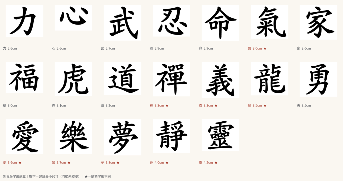
So we measured it ourselves. Each character was rendered from a licensed Taiwan standard-form calligraphic typeface, not drawn by any generative model; the stroke skeleton was extracted and the width measured along it, giving the width of the thinnest stroke as a fraction of the character’s own square.
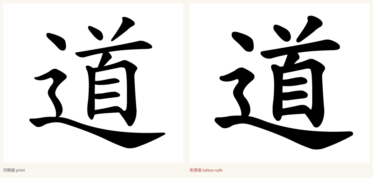
The absolute answer — how many centimetres — depends on a number nobody has published: the finest line that survives in skin. Until a tattooer supplies that figure, we will not print centimetres. But the ratios hold whatever that figure turns out to be. Taking 力, the least demanding character we measured, as 1.00:
| Character | Meaning | Size needed, relative to 力 |
|---|---|---|
| 力 | strength | 1.00 |
| 心 | heart | 1.00 |
| 武 | martial | 1.04 |
| 忍 | endure | 1.12 |
| 氣 | qi | 1.15 |
| 福 | good fortune | 1.15 |
| 道 | way | 1.23 |
| 龍 | dragon | 1.35 |
| 愛 | love | 1.38 |
| 夢 | dream | 1.46 |
| 靜 | stillness | 1.54 |
| 靈 | spirit | 1.62 |
Read it this way: whatever size makes 力 safe, 靈 needs to be roughly sixty per cent larger to be equally safe. 愛 needs about forty per cent more than 力. A pair of characters chosen for their meaning and set at the same size are not equally likely to survive, and the difference is not small.
The other half of the measurement is worth stating because it cuts the other way. We looked for pinch points — places where two strokes come close enough that ink spread will merge them — and of nineteen common characters, only two had any: 夢 with one, 靈 with two. The rest had none. Thickening a character’s thin strokes, which a competent artist does by eye, genuinely solves most of the problem. It is only the densest characters where a stroke has to be moved rather than thickened, and moving a stroke is a calligrapher’s job, not a filter’s.
What to actually do
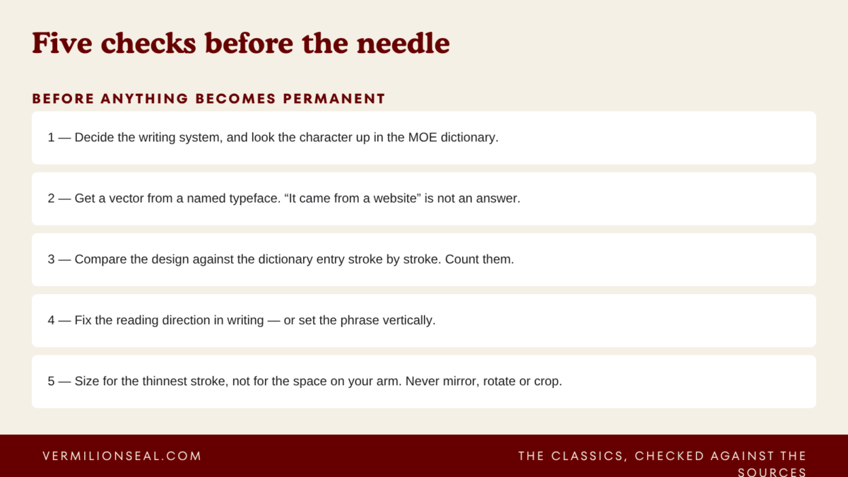
- Decide which writing system you want, and say so. If you want the traditional form, look the character up in the MOE dictionary and take that entry to the studio.
- Get the design as a vector file, from a named typeface, and ask which typeface. “It came from a website” is not an answer.
- Compare the design against the dictionary entry stroke by stroke. Count them.
- State the reading direction in writing if the design is horizontal. Better: set it vertically.
- Ask the artist directly what the smallest line they can lay down cleanly is, and how it will look in ten years. Then size the character for its thinnest stroke, not for the space on your arm.
- Do not mirror, rotate, or crop it.
What we do not do
We do not check individual tattoo designs, and we will not start. A private verification service makes the checking unfalsifiable — you would have only our word for it. Everything we know is published instead, in the character library, where each entry carries its dictionary reference and its sources, and you or your artist can check the work.
How entries here are made, and which editions and dictionaries they are checked against, is set out on the methodology page. When we get something wrong, the correction is public in the corrections log — including, as it happens, an error in an earlier draft of this article, which claimed the Taiwan and Japanese forms of 辶 differ by the number of dots. They do not. The difference is stroke count and shape, and the Agency for Cultural Affairs page linked above is what settled it.
If the mistakes above leave you wondering which script to learn in the first place, the answer turns on a smaller number than most people expect: traditional or simplified.
Traditional forms also differ slightly between Taiwan and Hong Kong — 衛 or 衞, 裡 or 裏 — so for anything permanent, check the character against Taiwan’s Ministry of Education standard. The differences are set out in does Taiwan use traditional Chinese?